When I did my crowdfunding campaign back in April, to raise money to take the It's Business Time program, the main thing I did to raise money was sell my time as a designer. People could buy my time in 1-hour blocks, which I valued at $50/hour. A couple of people bought 10 and 20 hours of my time, but most people bought 1 or 2.
One such person was my friend Hannah. She was starting a small business and wanted a logo designed for it. She's an amazing gal, super positive and energetic, and passionate about the environment. She was creating a summer job for herself, in between living in Edmonton, and moving to Budapest in the fall with her boyfriend. Her plan: to give walking tours in Margaree.
Hannah bought 2 hours of my time, which to be honest isn't really enough for a proper, in-depth logo design, but the way I figured it with the crowdfunding perks, was that I'd be honest with people about what I could do in the time they had purchased, and do my best for them in the time allotted. And, it worked out. With Hannah, we already communicate well with each other, and she liked my work, so that cut a lot of time out of the process.
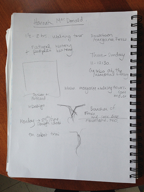
We started with an in-person client meeting. I asked her all about her new business and what her plans were. I took notes in my sketchbook and sketched out some of the things she described:
We used a private Pinterest board to collect ideas and similar logos that she liked.
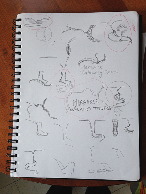
Then I spent some time sketching out ideas based on the Pinterest board:
I picked out the six that I liked the most (circled in red) and re-drew them on tracing paper with Sharpie. This, I scanned and emailed them to Hannah:
She picked out the ones she liked the most and then I scanned the Sharpie drawings at a high resolution (600 dpi), and used Illustrator to Image Trace them. This is how you vectorize (make digital) any hand-lettering project.
Then, in lllustrator, I created the logo variations:
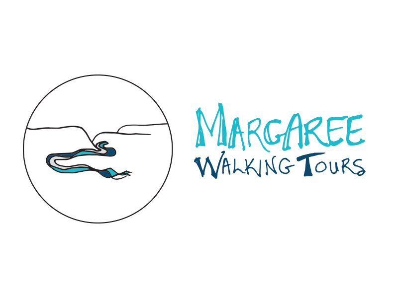
Hannah got to choose which ones were her favorites, and then I'd tweak accordingly, depending on what she wanted. She liked the hand-lettering, but wanted to try the circular logo with it. We did some back and forth, and in the end, this is what she got: four variations to use where she wanted.
Even though it was a fairly quick process, I really enjoyed this logo design! And even more, seeing it in action: here is a post Hannah wrote about the logo, on her business blog.


